-
Bling Nails
-
Quyen Nguyen Owner of Bling Nail Studio, an established nail studio located in Vancouver's historic Gastown neighbourhood. With a vision to elevate the traditional nail salon experience, Quyen is focused on creating a welcoming, sophisticated beauty destination where exceptional service, consistency, cleanliness, and genuine hospitality come together.
-
Brand Strategy & Identity Design
Rebrand
Logo Design
Brand Guidelines
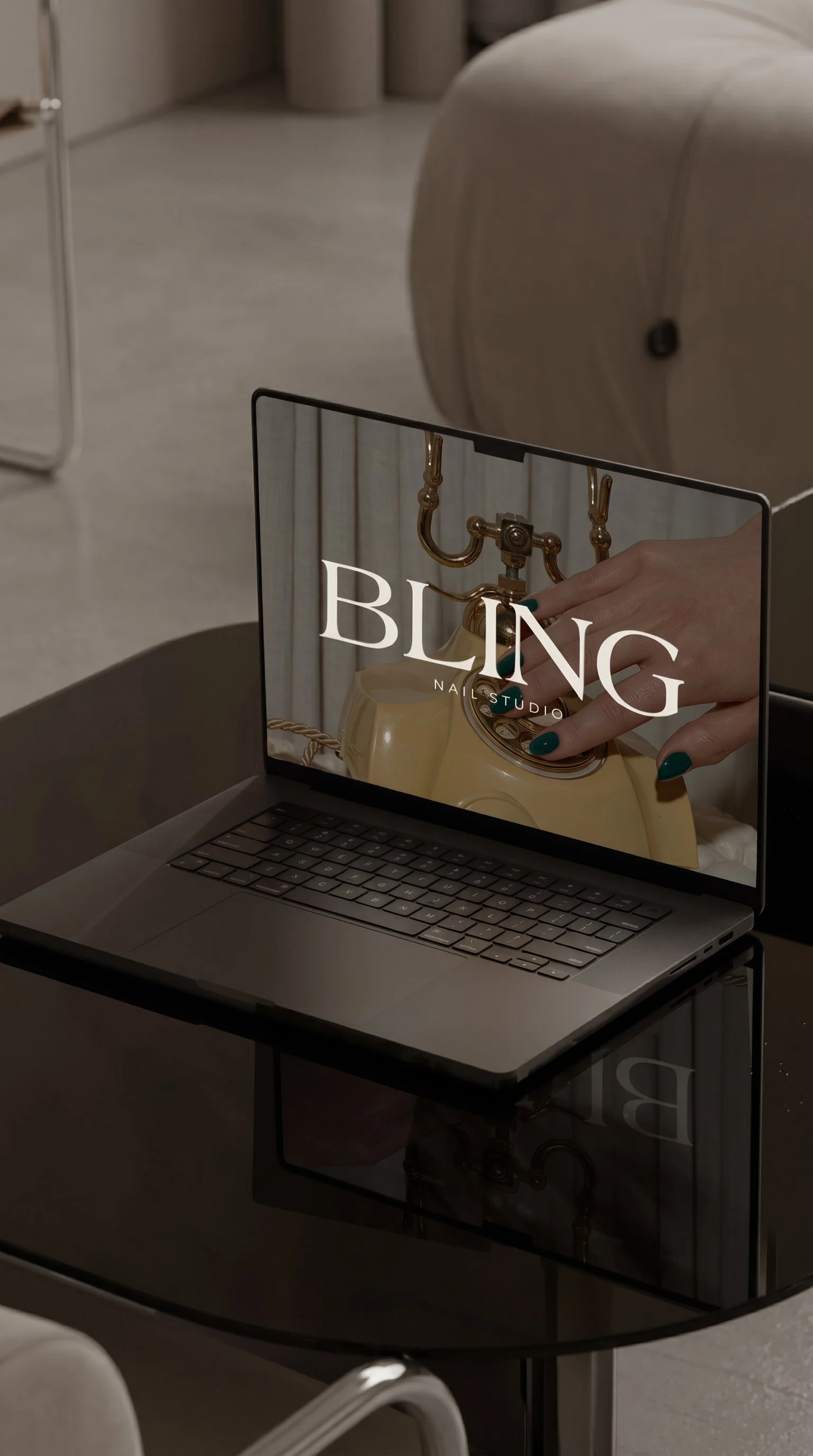
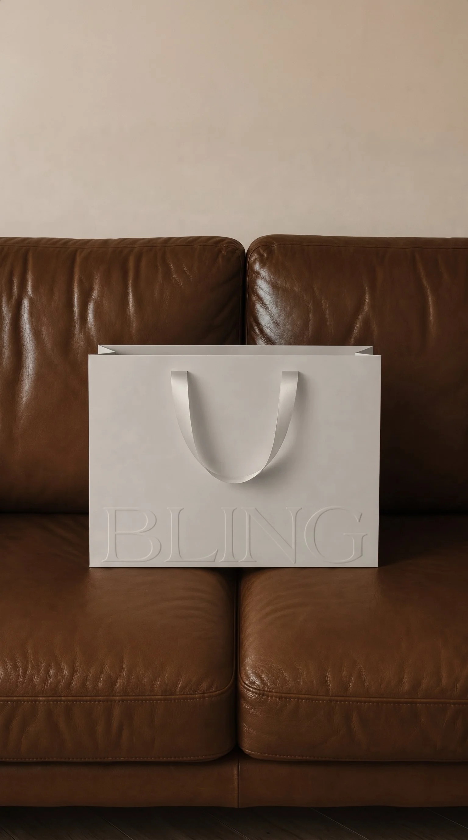
Brand Collateral & Mockups
-
Beauty & Wellness
Nail Care
Luxury Beauty
Lifestyle & Hospitality
-
Refined
Timeless
Sophisticated
Minimal
Editorial
Welcoming
-
Located in the heart of Gastown, Vancouver, Bling Nail Studio has established itself as a familiar destination for nail care, building a loyal clientele and strong community recognition over the years.
As the business entered its next chapter, founder Quyen Nguyen envisioned a more refined and intentional identity that would reflect the elevated experience she was working to create. Rather than reinventing the business, the goal was to preserve the recognition and approachability of Bling while introducing a sophisticated visual identity that felt timeless, distinctive, and established.
Inspired by fashion-house aesthetics, contemporary hospitality, and understated luxury, Actorial Agency developed a refreshed brand identity designed to extend beyond traditional nail salon branding.
The result is a cohesive visual language that reflects Bling's evolution into a more polished, experience-driven beauty destination.
-
As Bling Nail Studio continued to evolve, its existing visual identity no longer fully reflected the level of sophistication, professionalism, and consistency the business wanted to communicate.
The challenge was to elevate the brand without losing the familiarity and recognition it had already established within the Gastown community.
The challenge was to:
Modernize the existing identity while preserving Bling's established name and brand recognition
Create a timeless, distinctive visual identity that would remain relevant for years to come
Move away from traditional nail salon aesthetics and predictable beauty-industry imagery
Position Bling as an elevated yet approachable beauty destination
Develop a recognizable logo system that could extend across physical and digital applications
Establish a cohesive visual foundation that reflected the studio's commitment to quality, consistency, cleanliness, and genuine hospitality
-
Our strategy centred on evolution rather than reinvention, creating an identity that honoured Bling's established presence while introducing a more sophisticated and intentional visual direction.
Drawing inspiration from luxury fashion houses, editorial design, and contemporary hospitality, we focused on restraint, proportion, typography, and timeless simplicity.
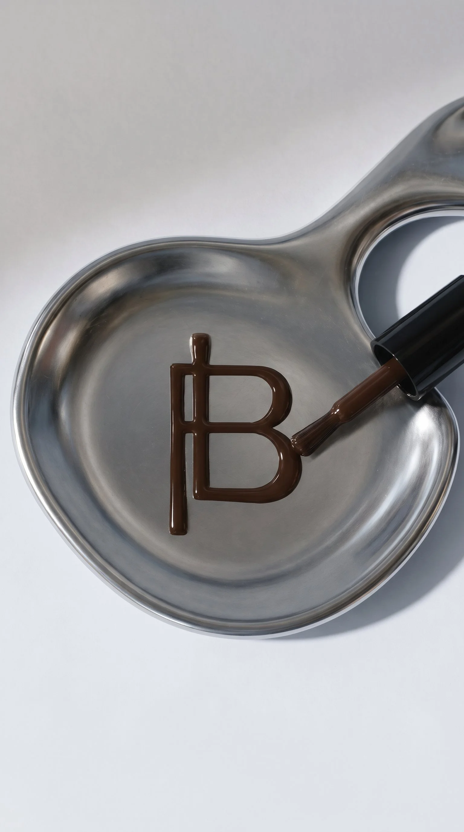
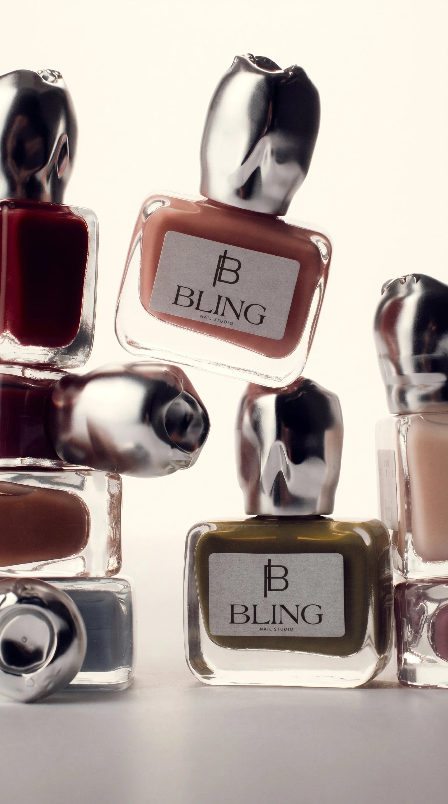
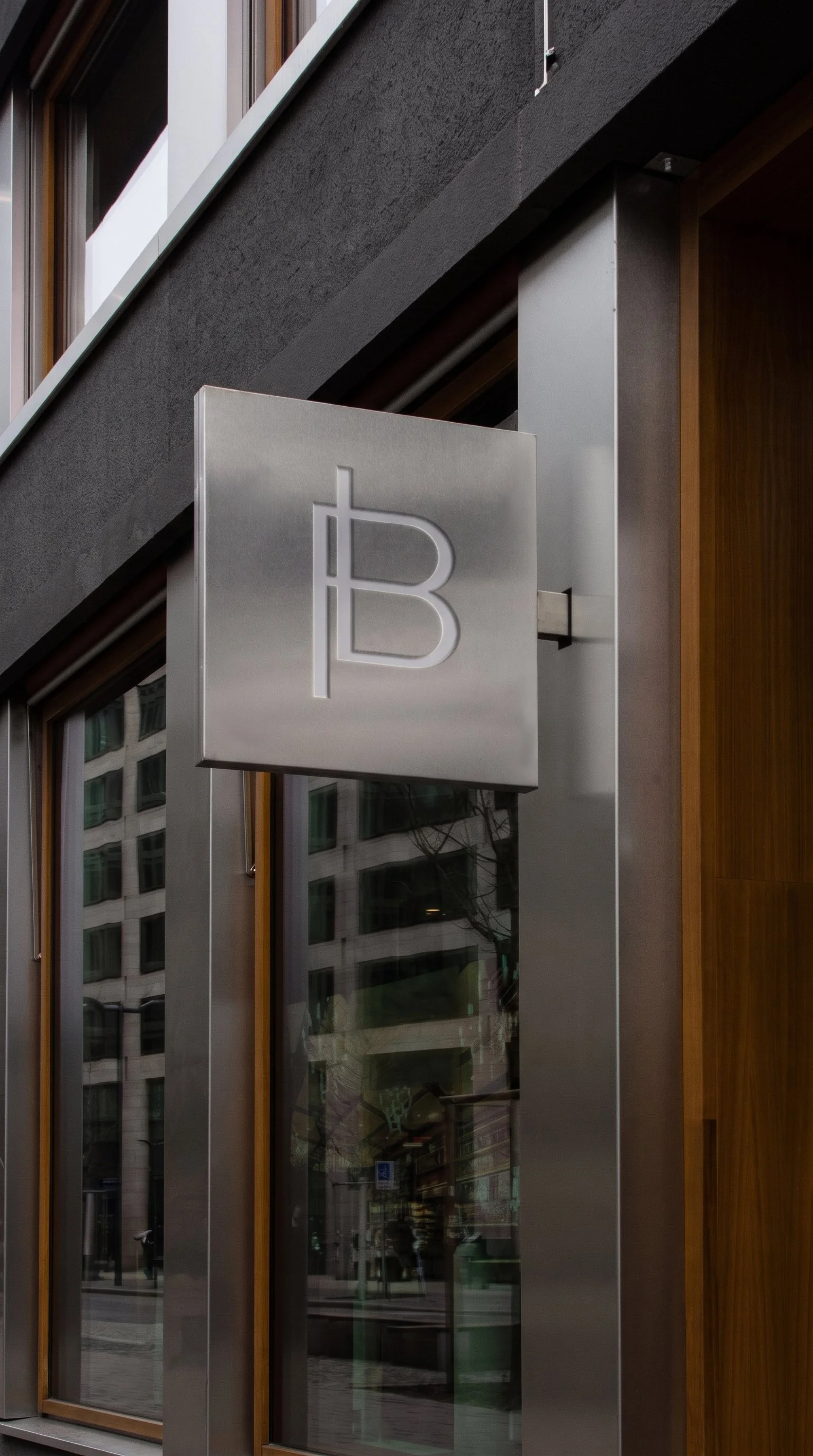
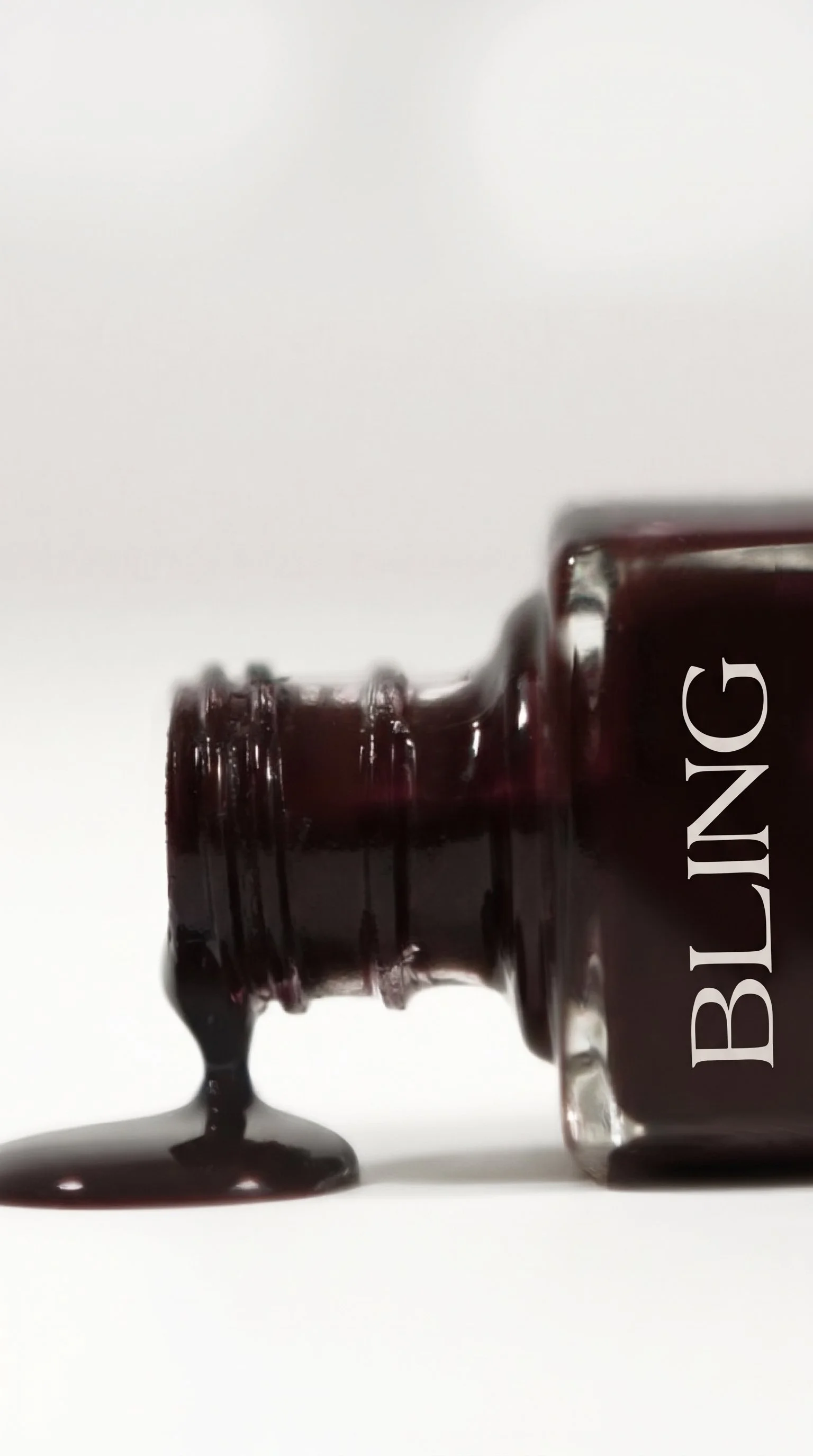
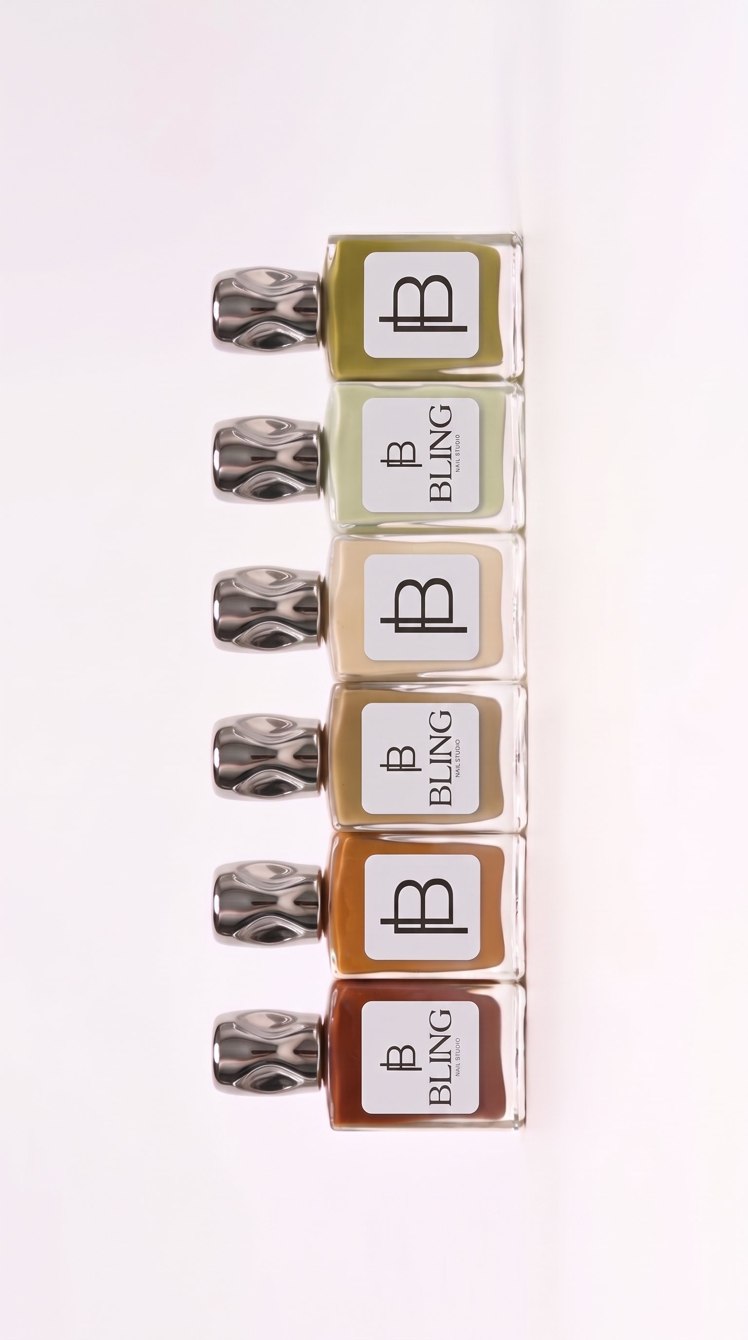
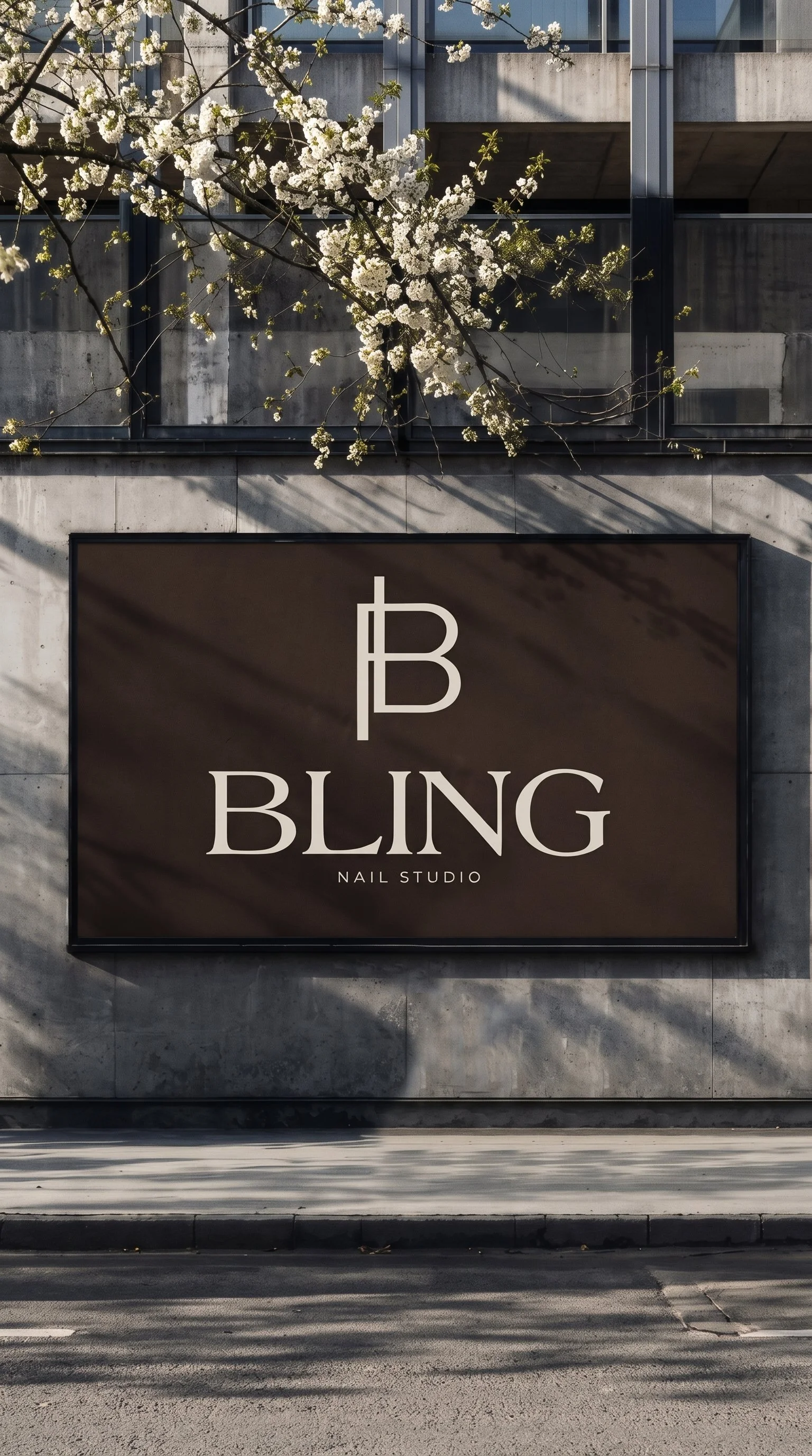
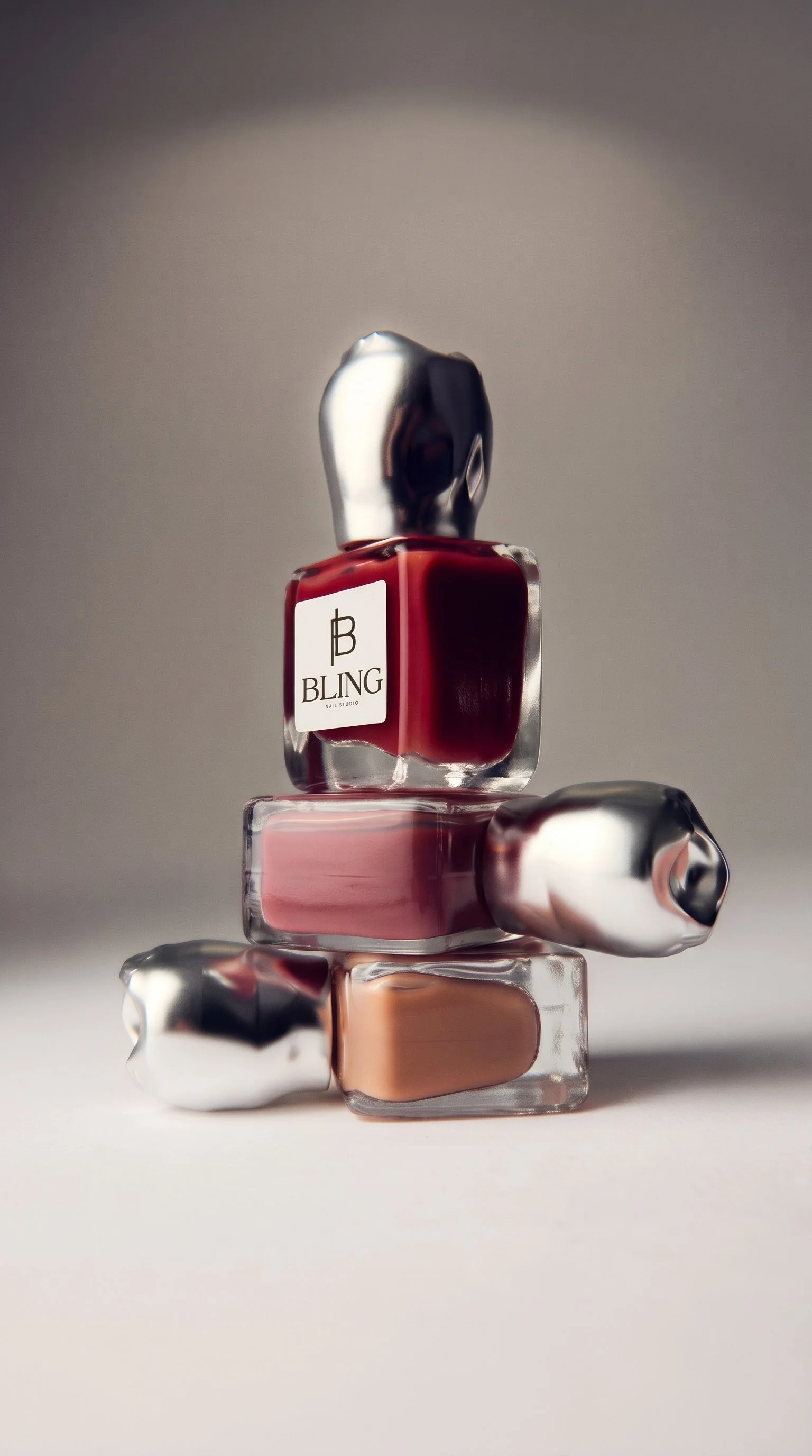
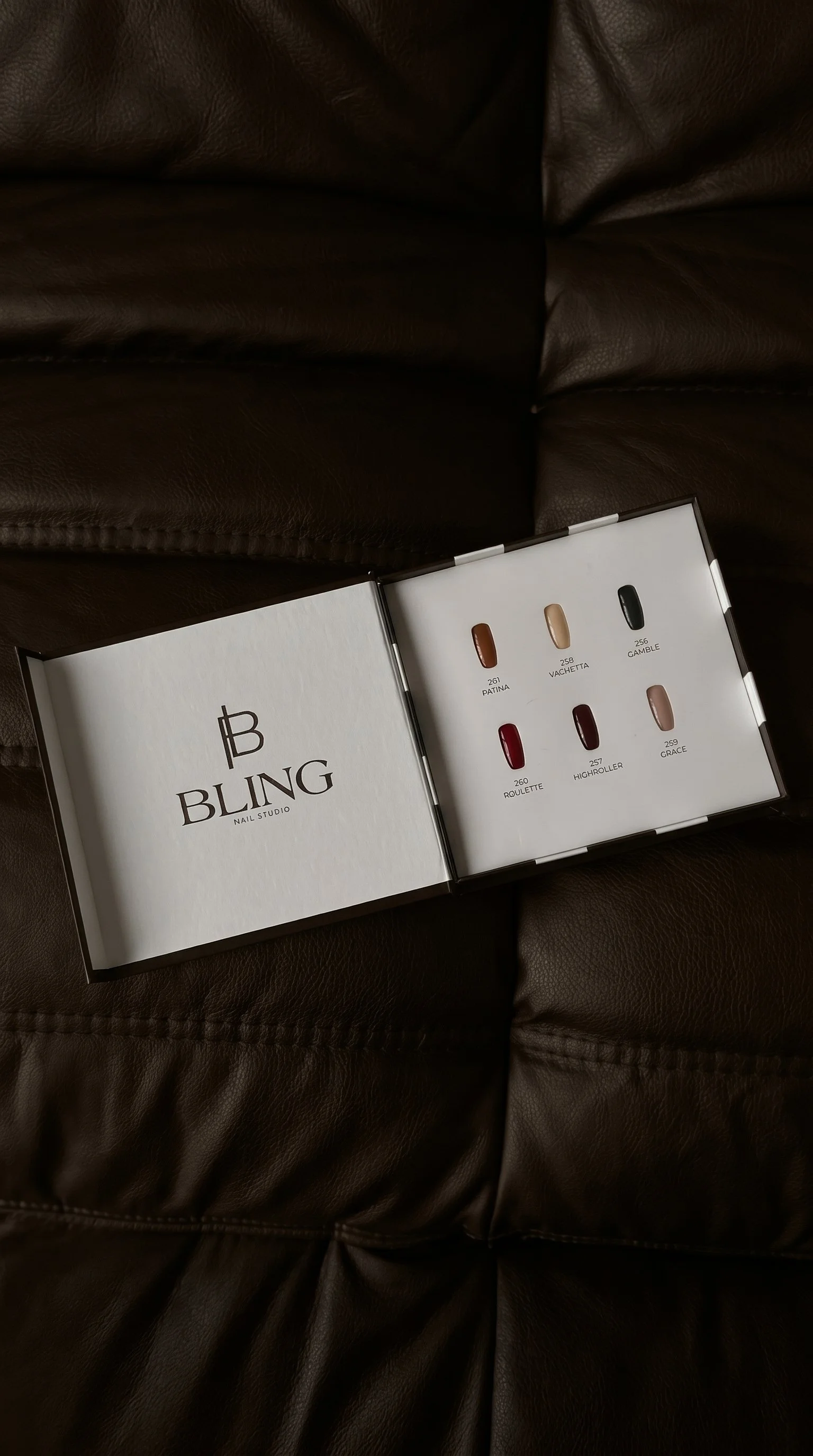
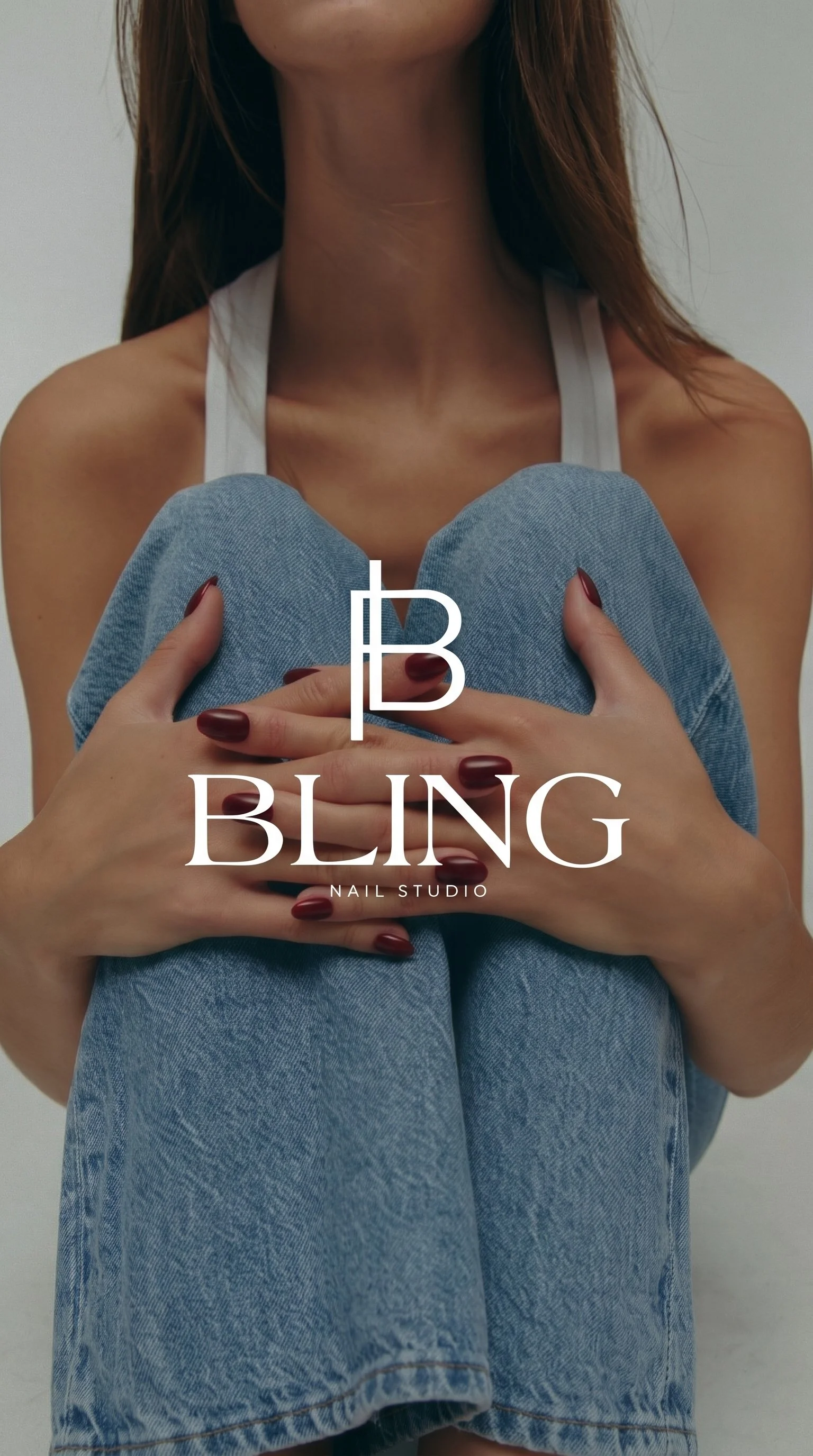
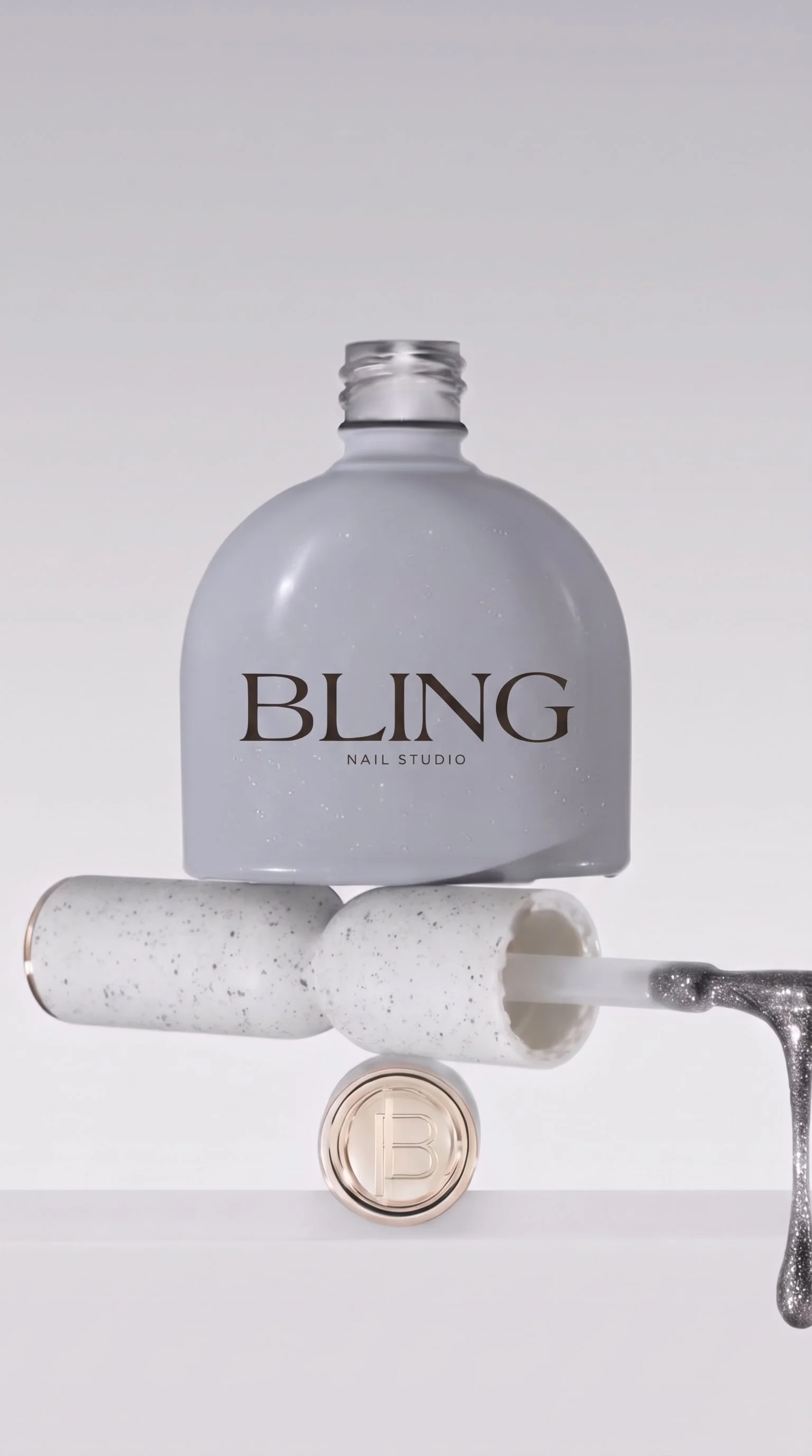
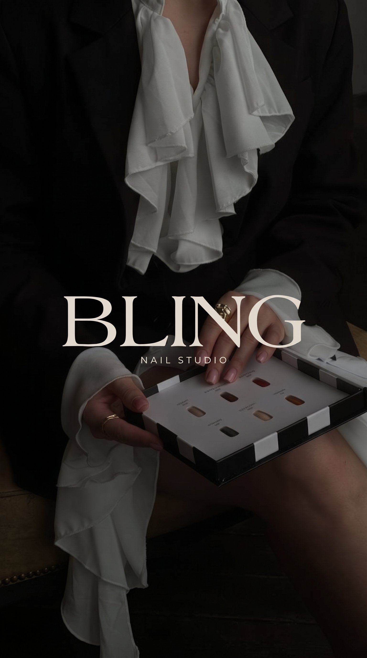
The visual identity brings together an elegant serif wordmark, a distinctive custom B monogram, and a carefully curated neutral colour palette. Each element was designed to feel refined and recognizable without relying on traditional nail or beauty industry symbols.
Key initiatives included:
Brand discovery, strategy, and positioning
Creative direction and visual research
Mood board development
Complete visual identity refresh
Custom wordmark and B monogram development
Primary and secondary logo variations
Refined neutral colour palette
Typography selection and hierarchy
Comprehensive brand guidelines
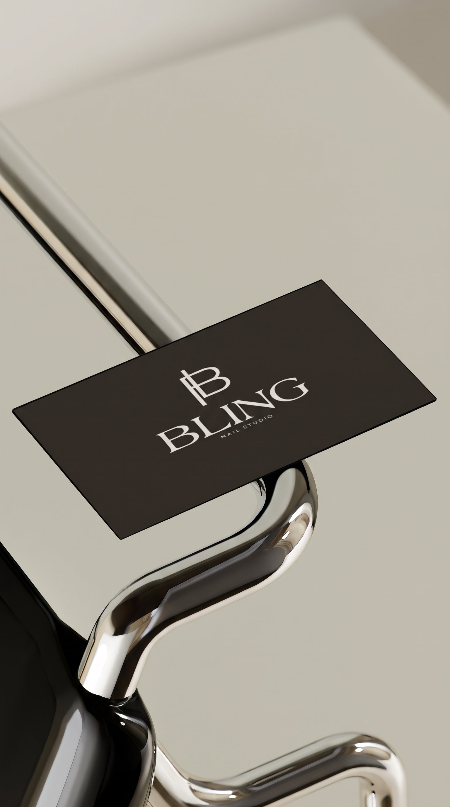
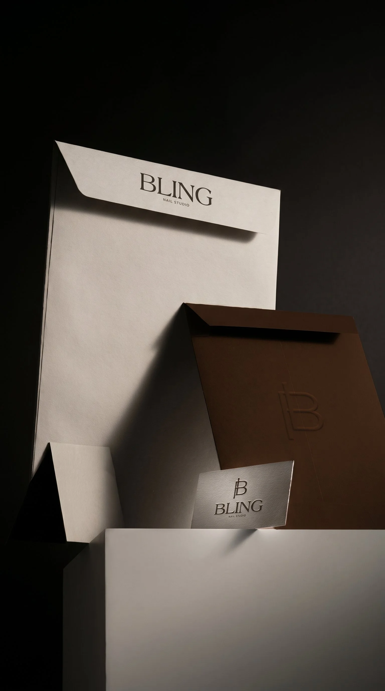
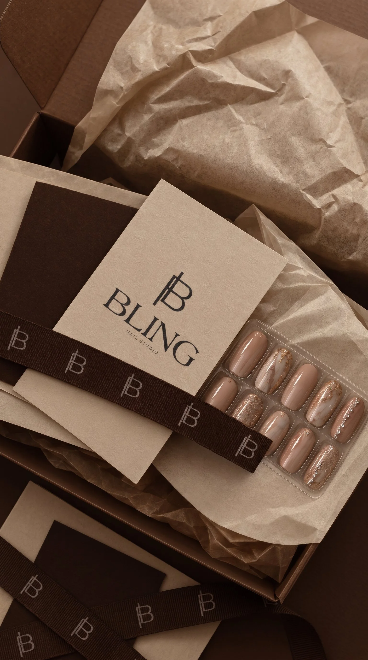
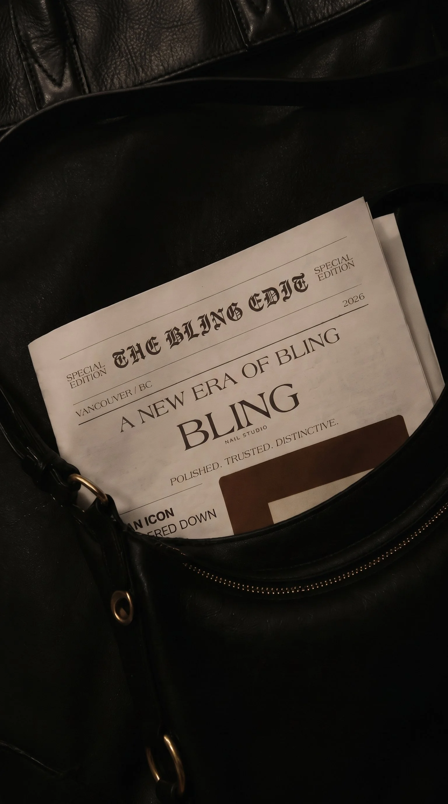
Business card and gift card design
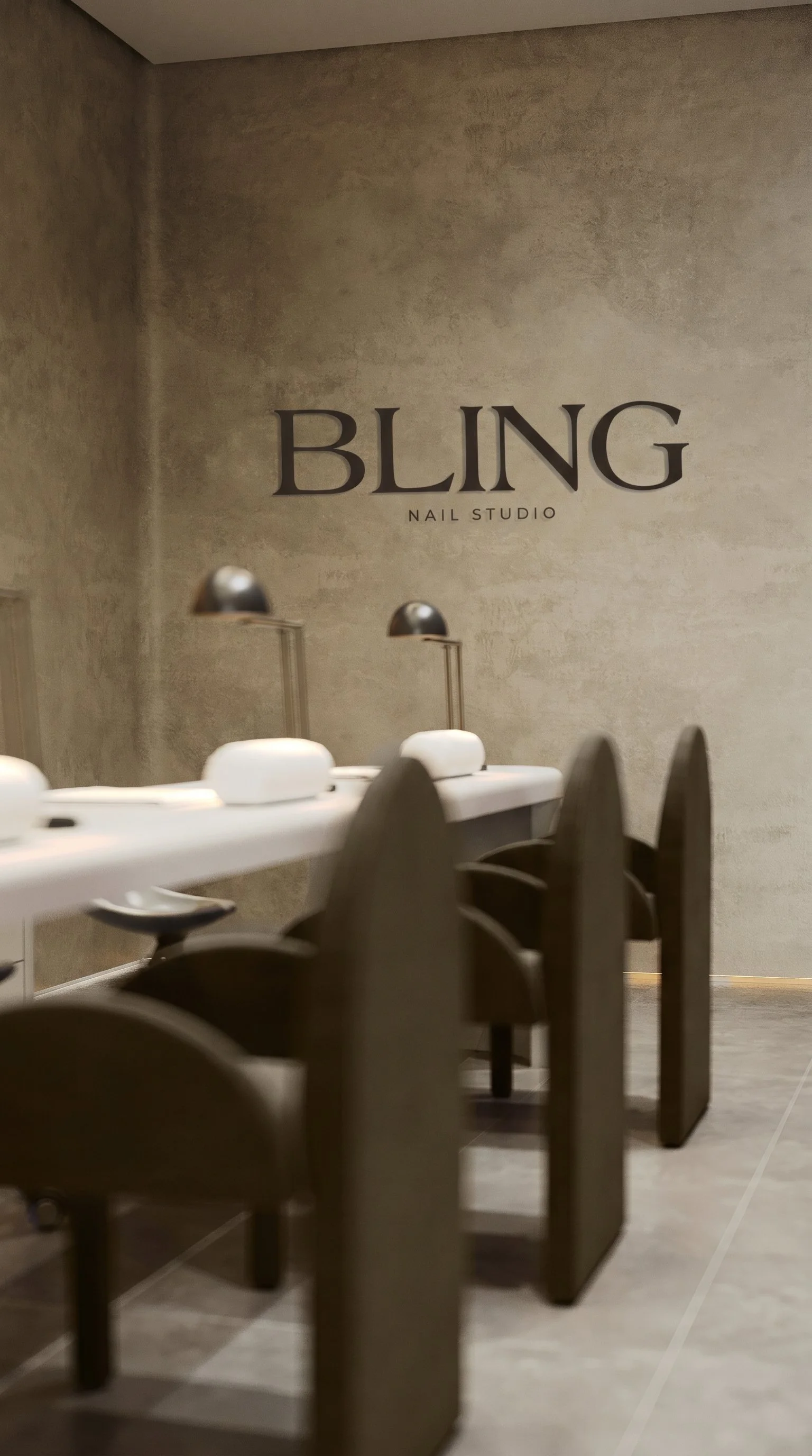
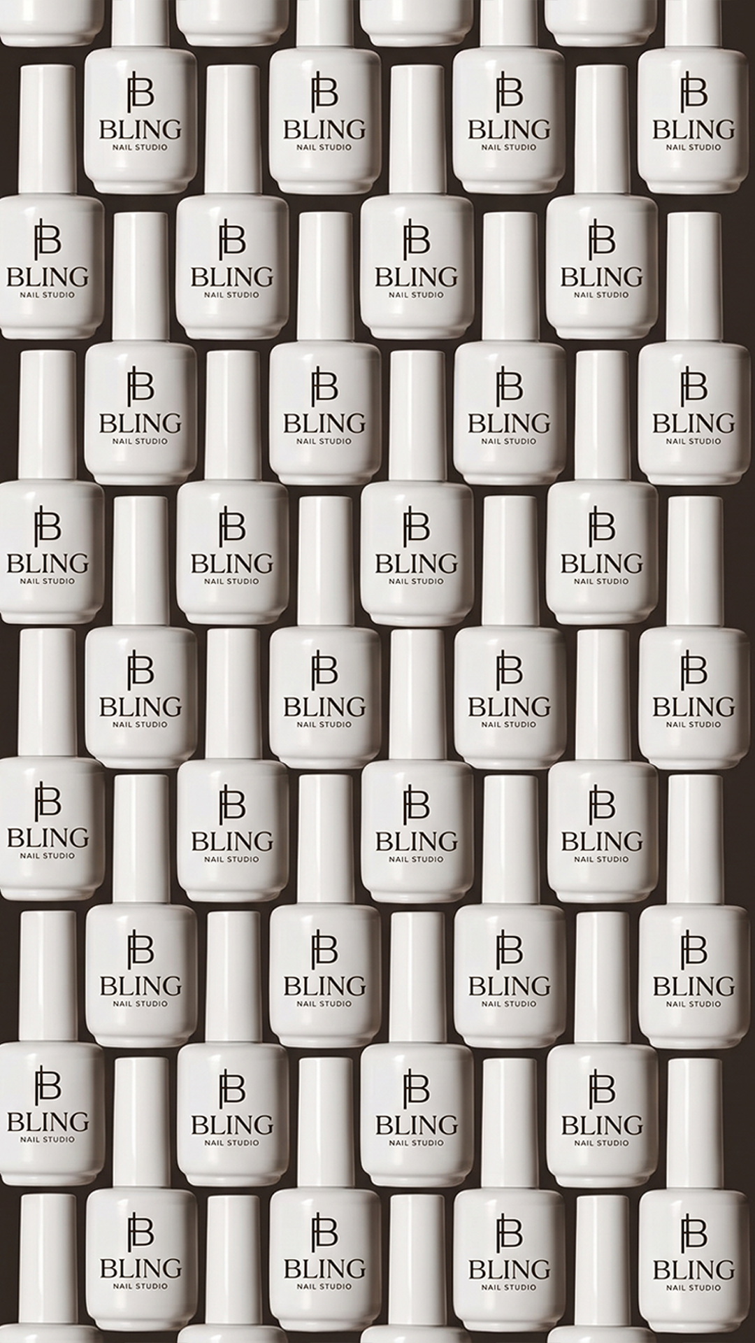
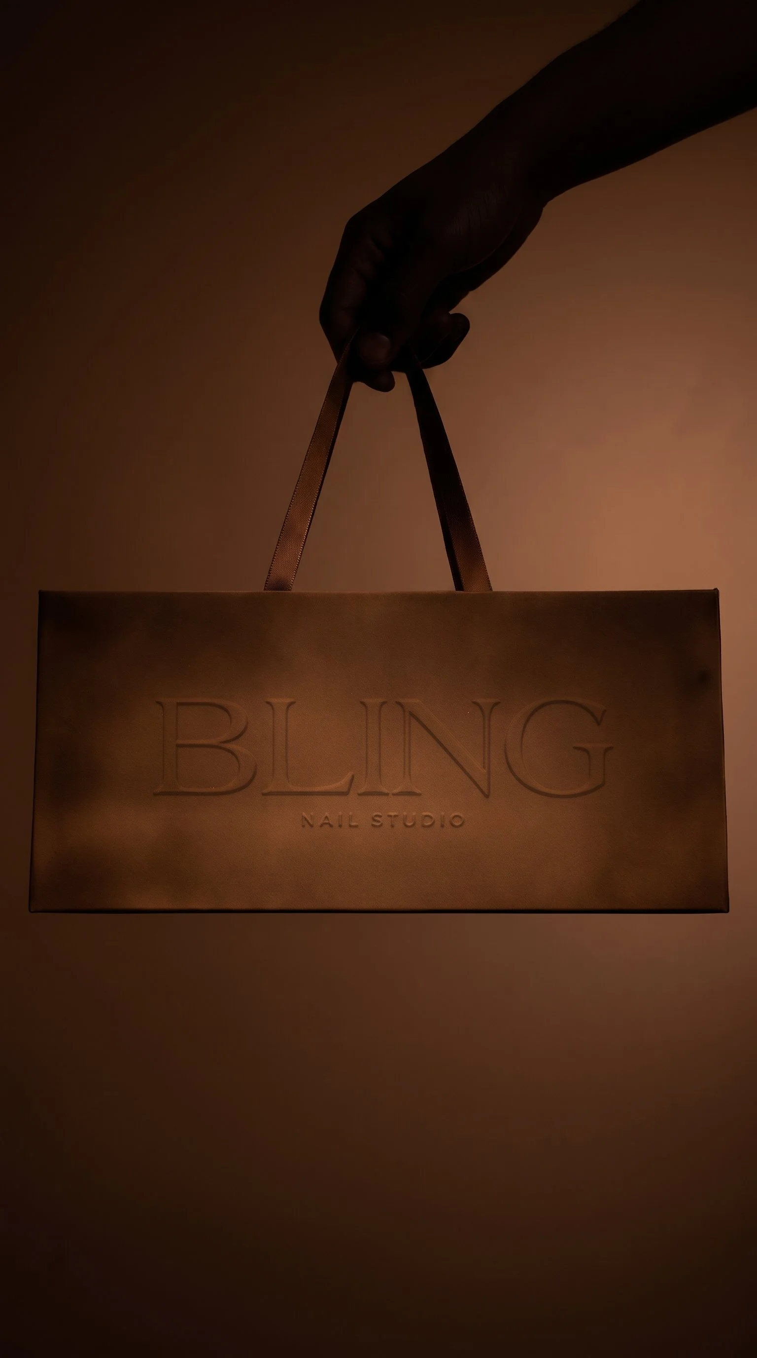
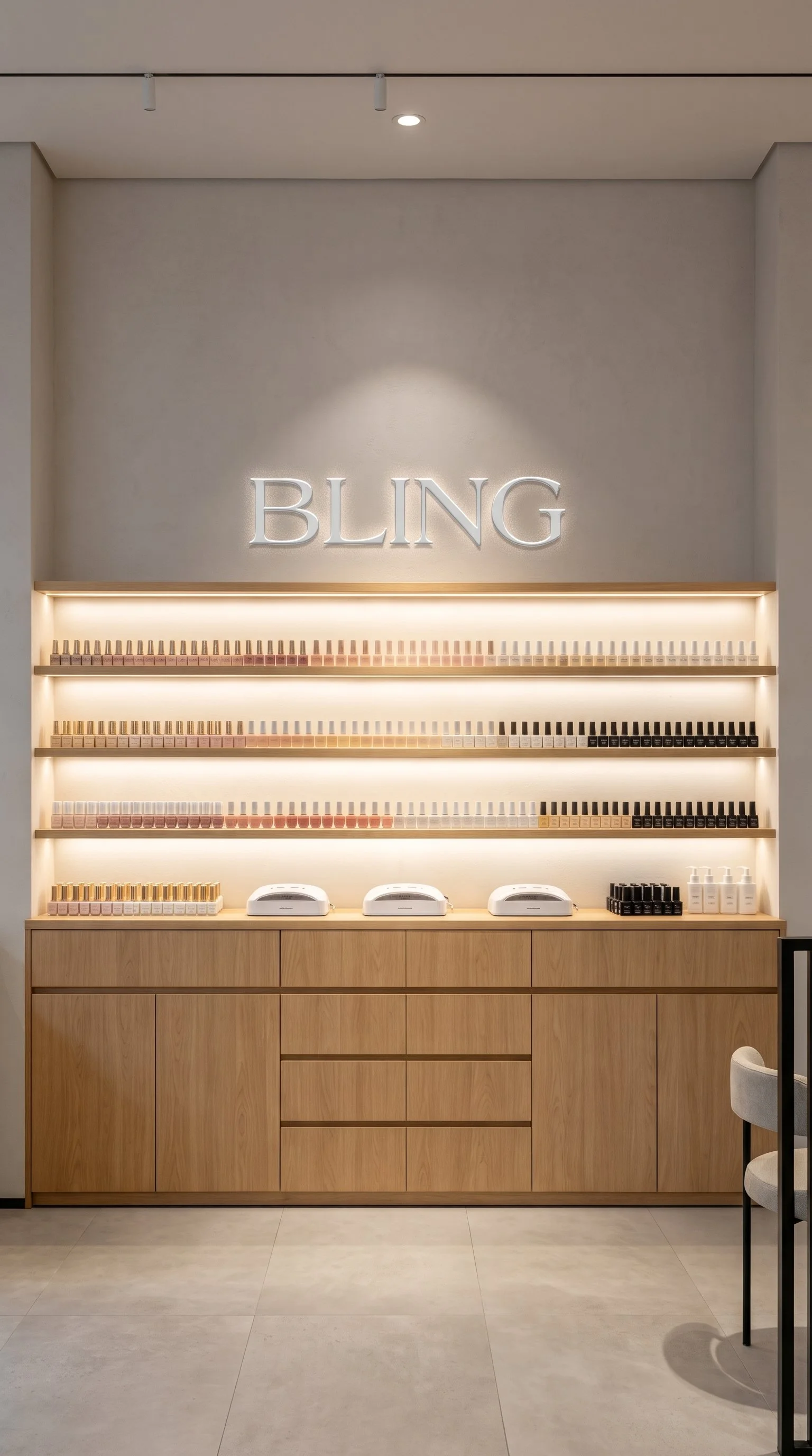
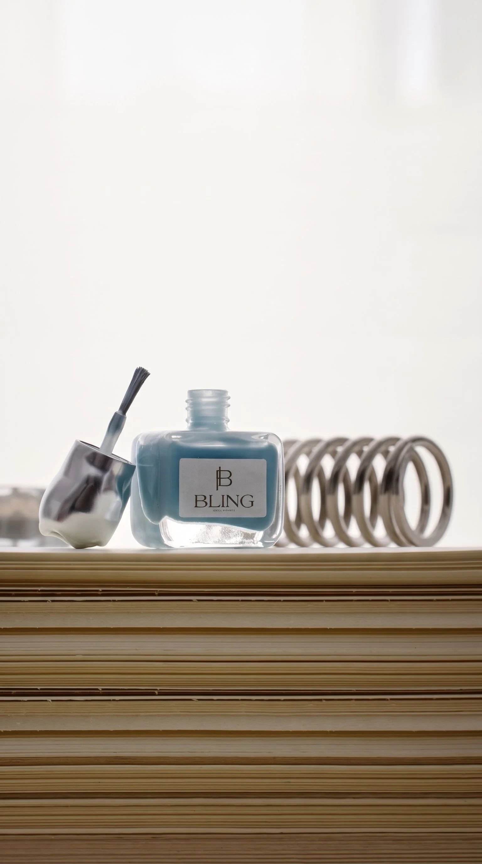
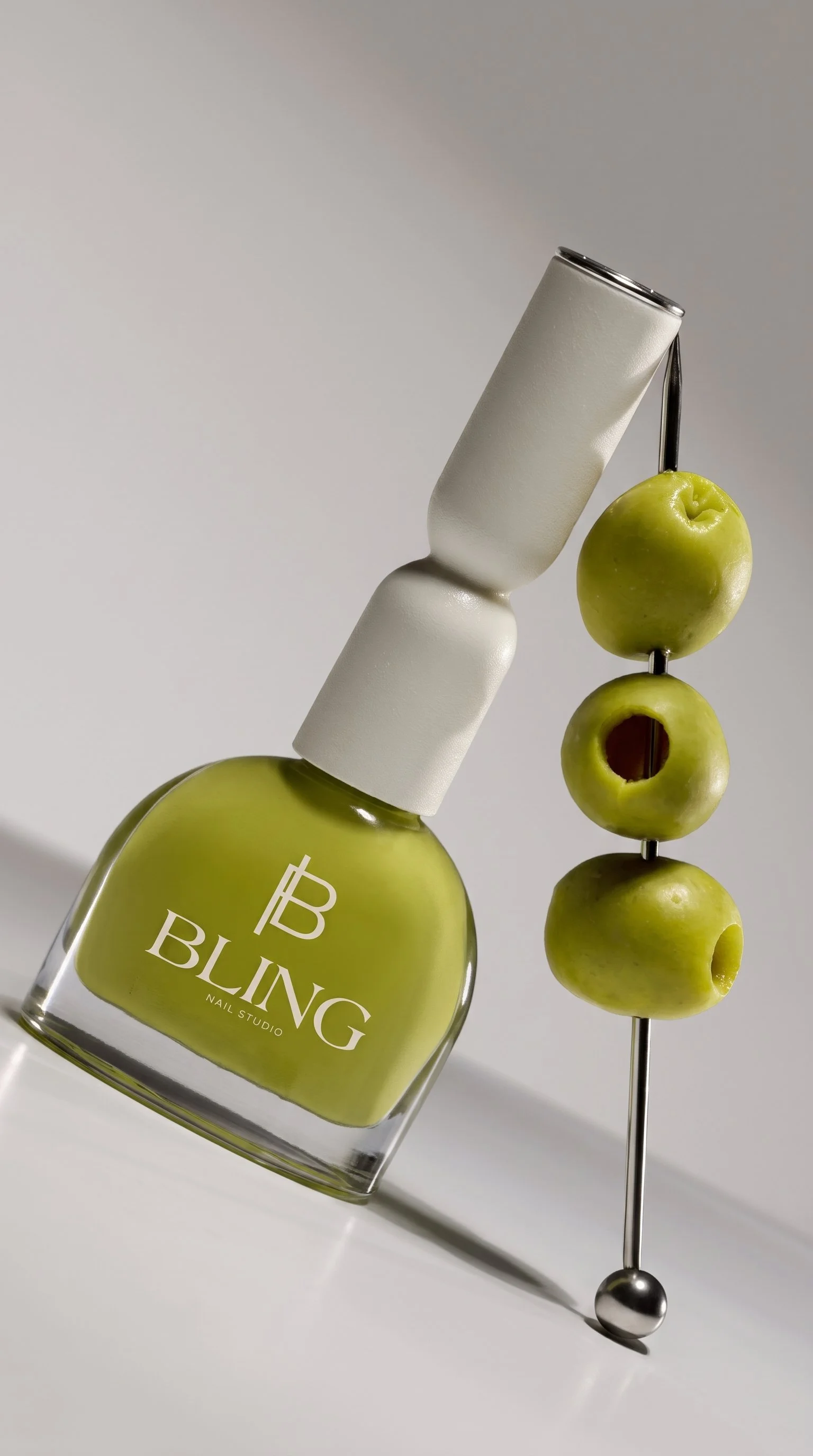
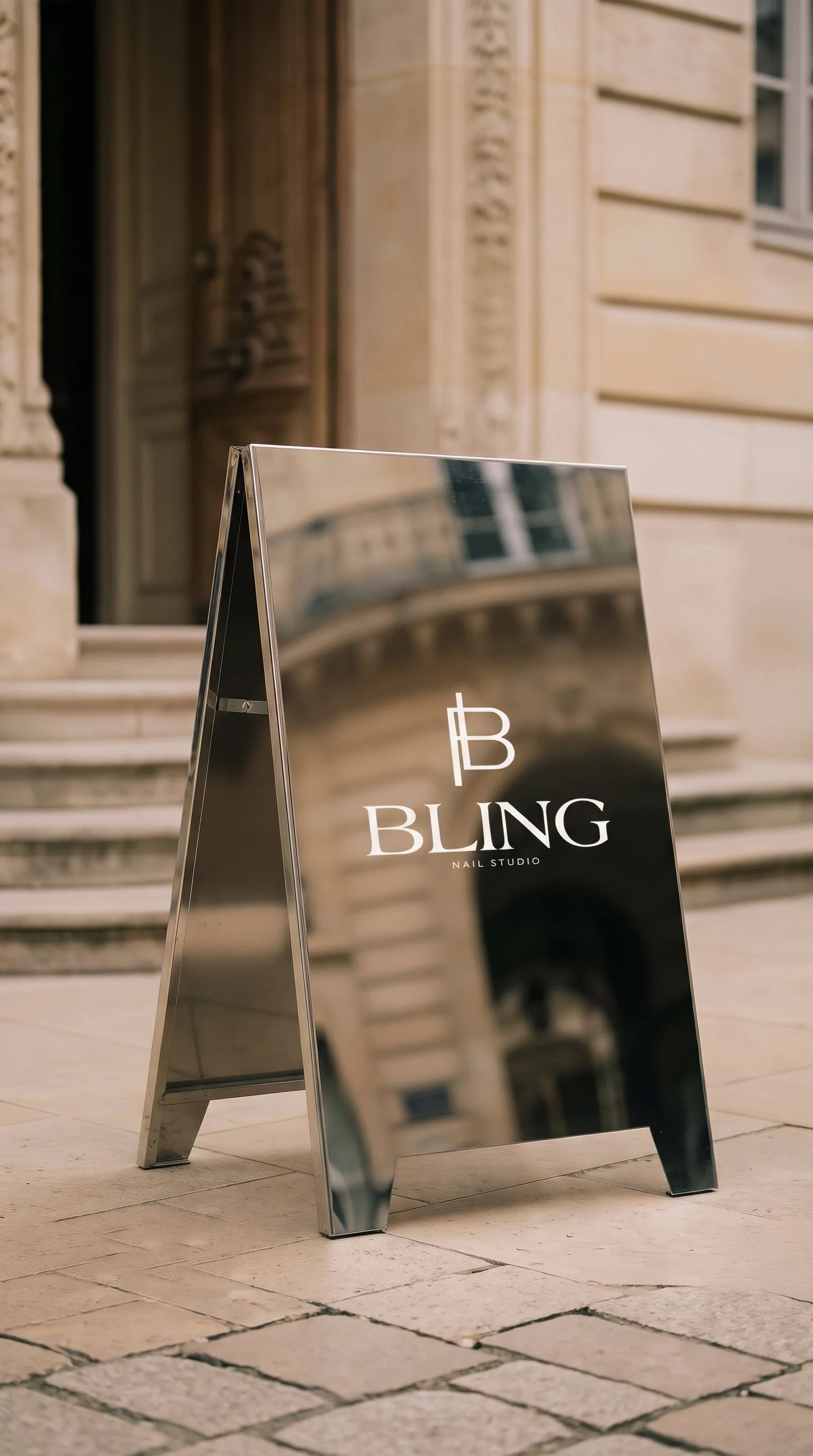
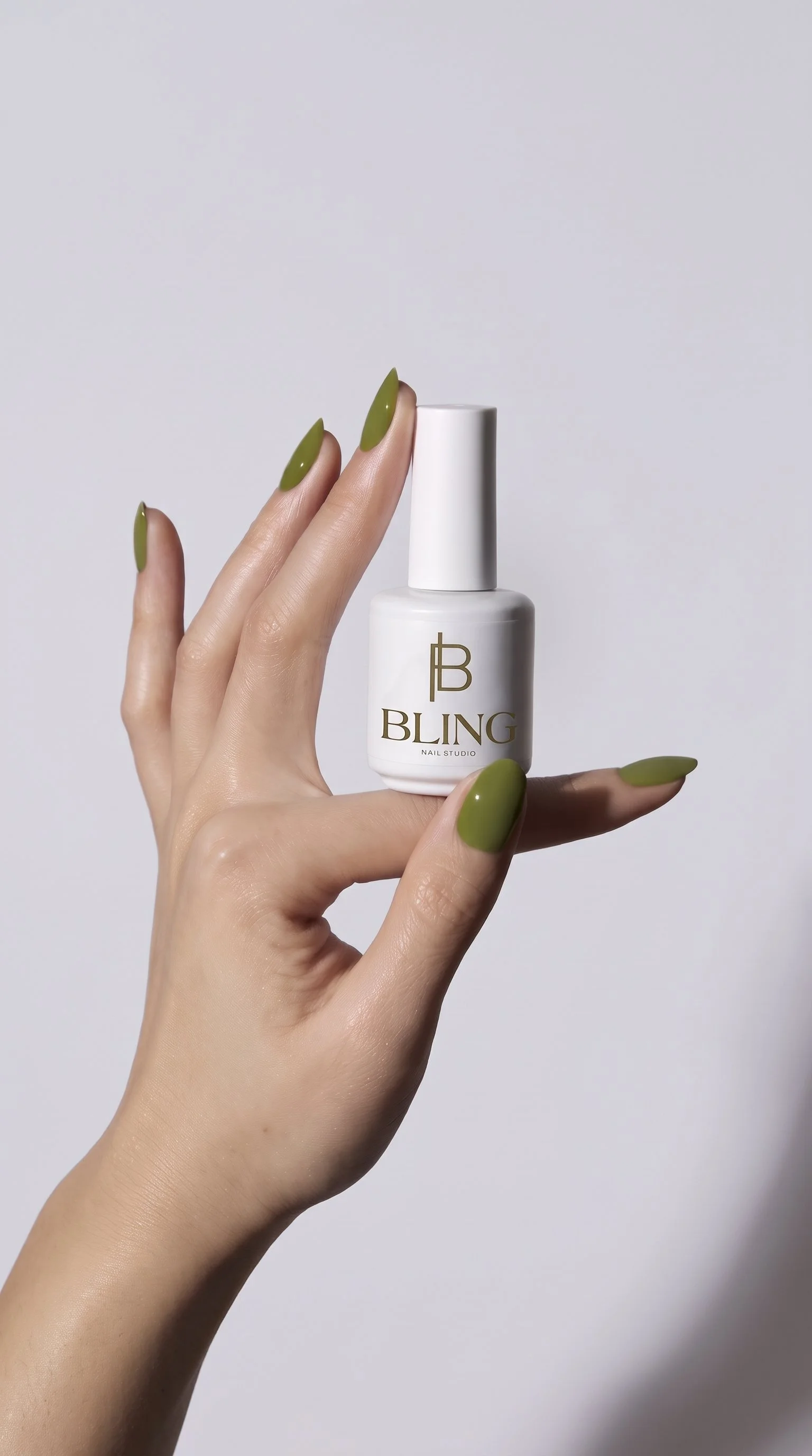
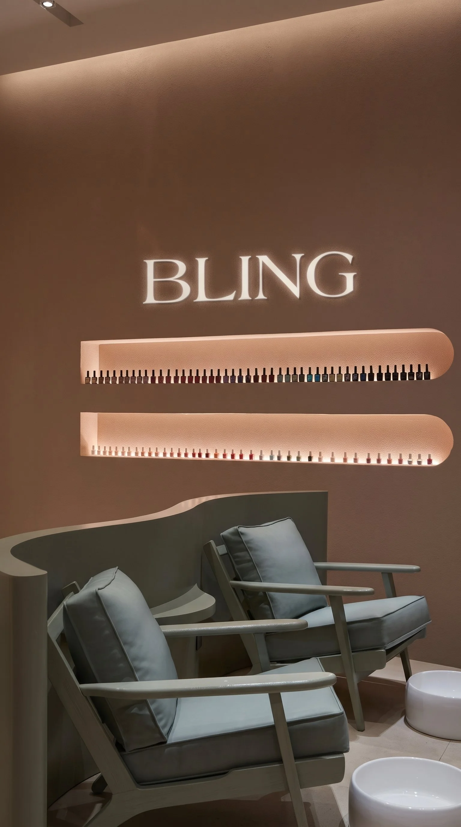
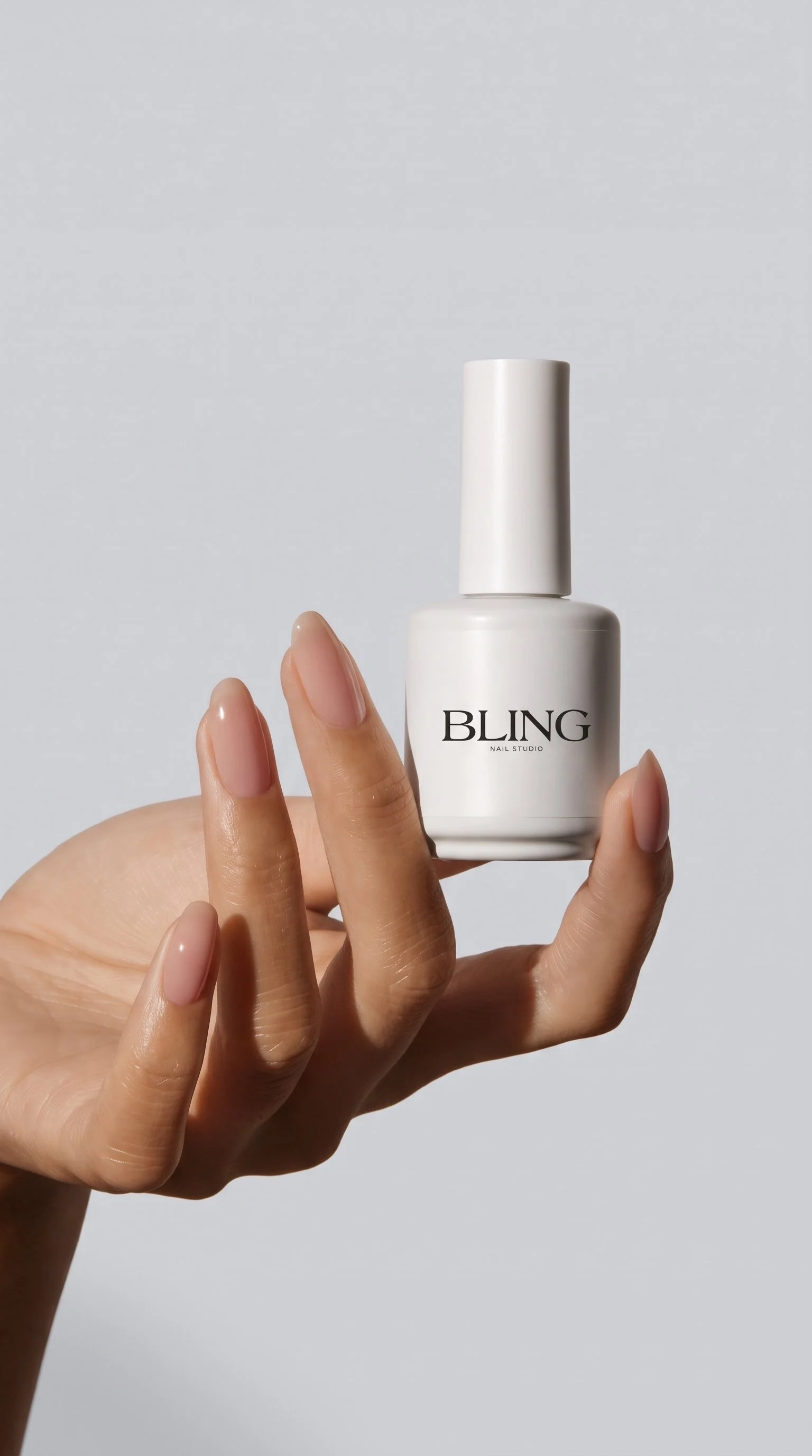
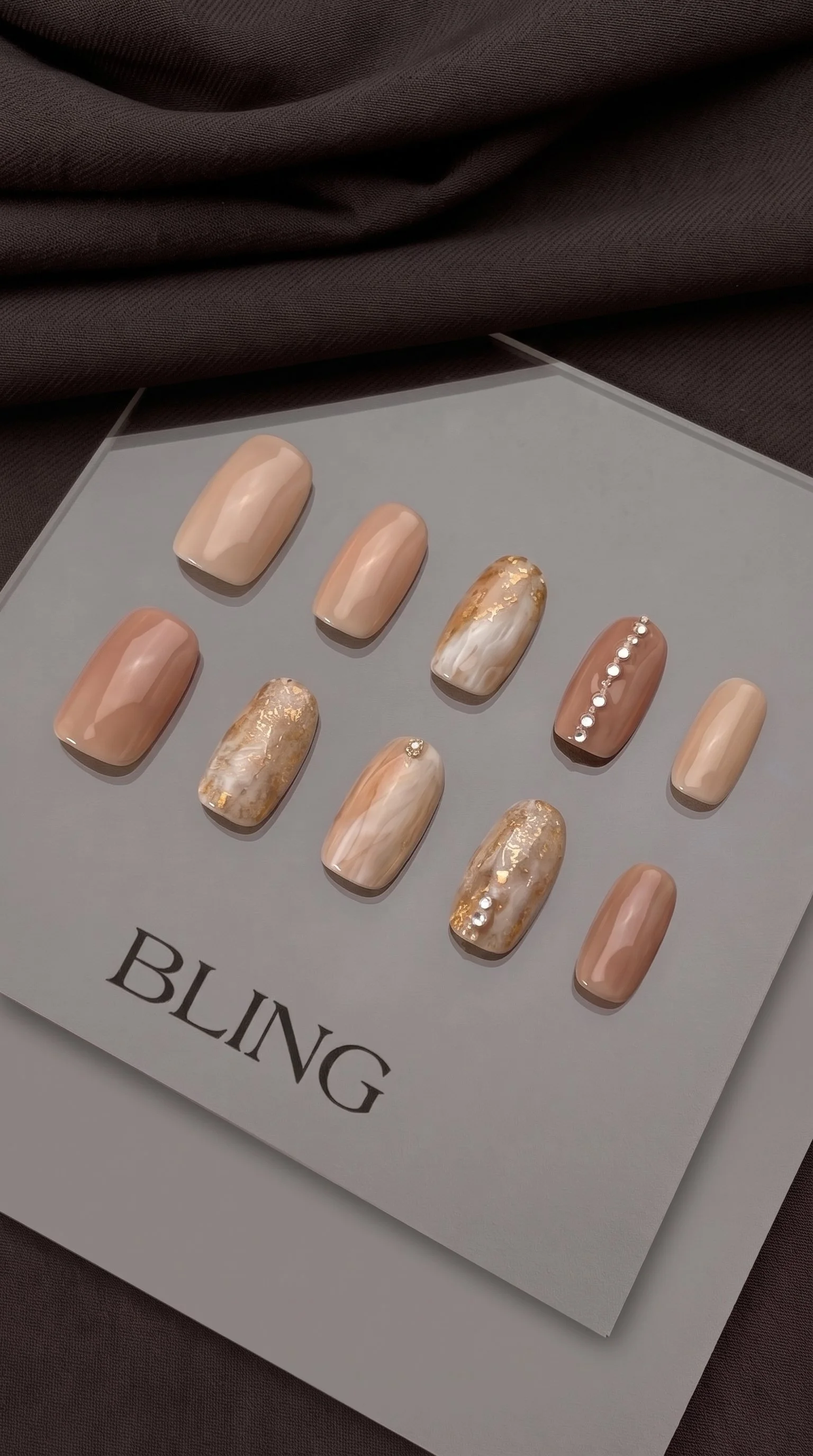
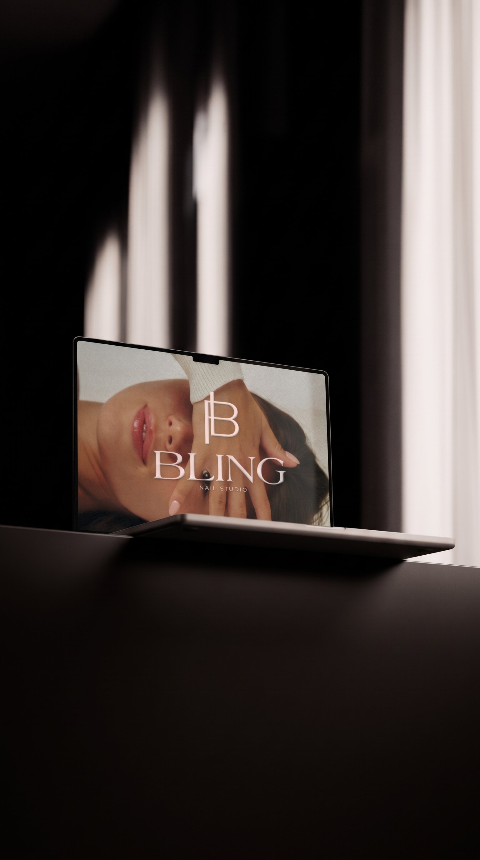
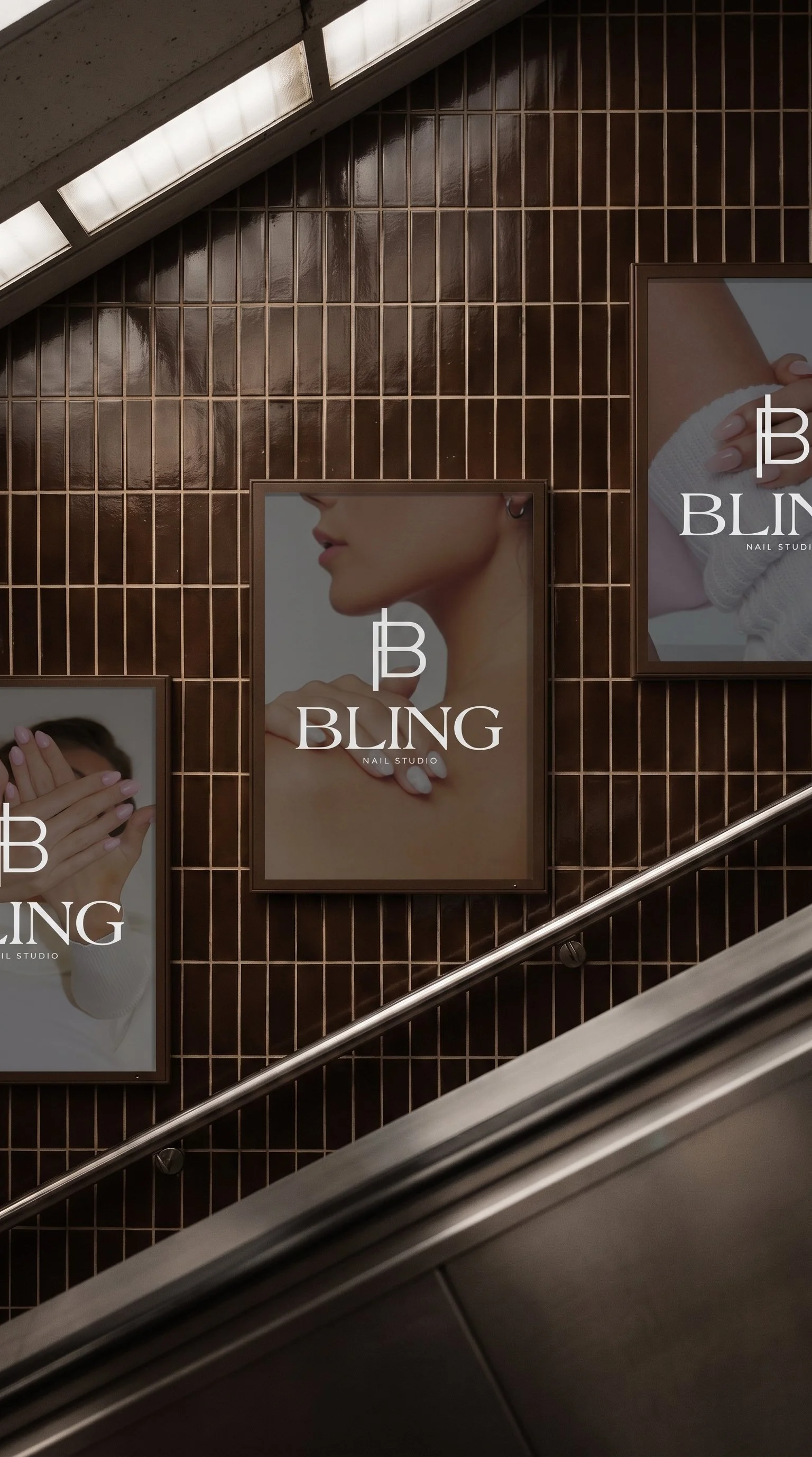
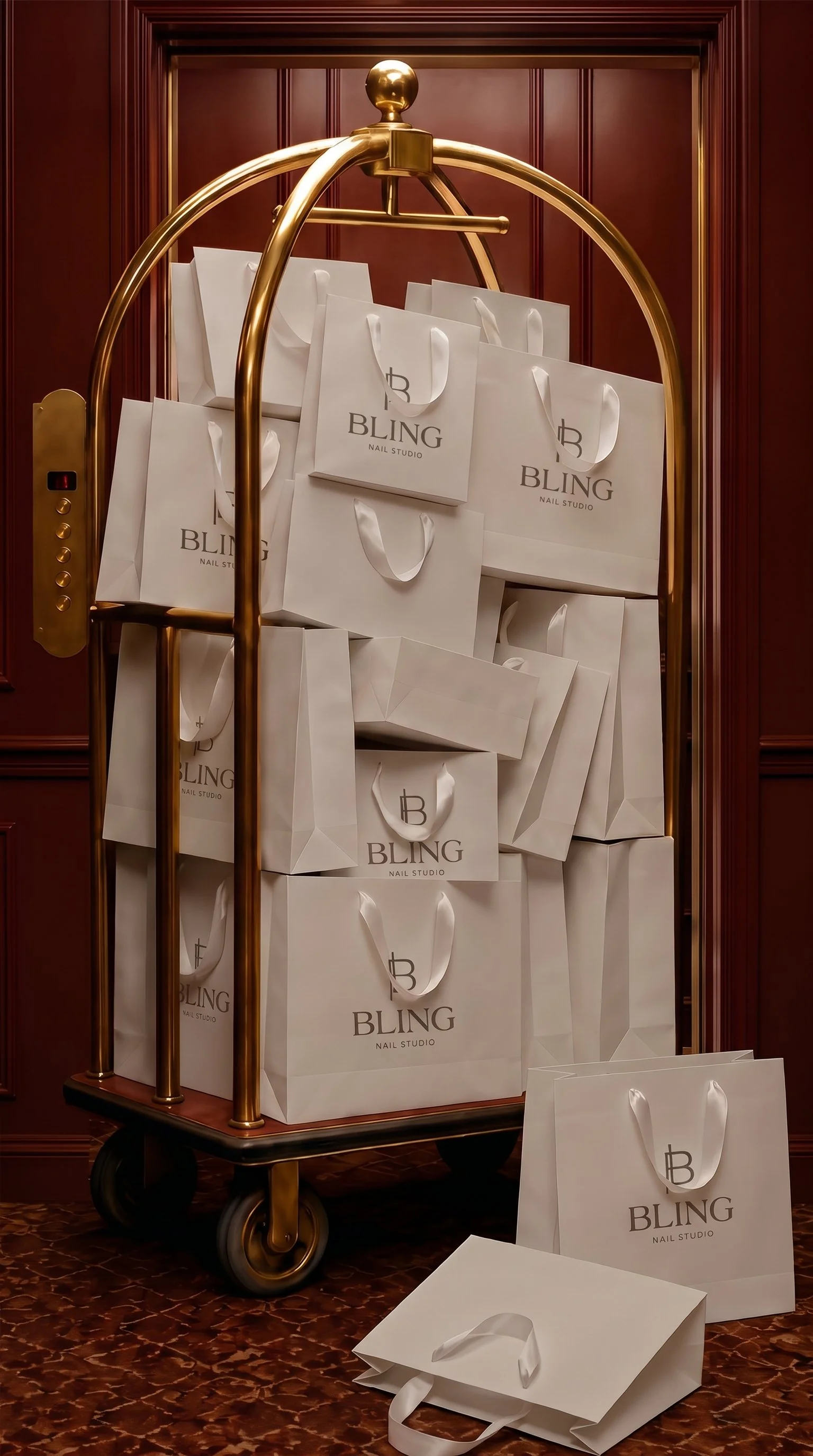
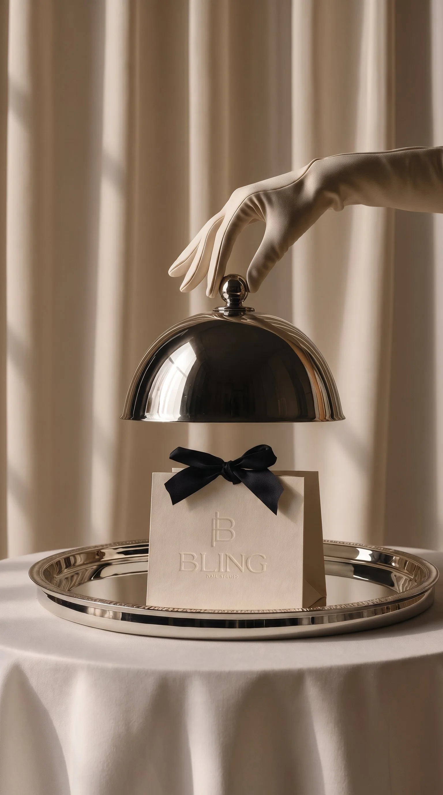
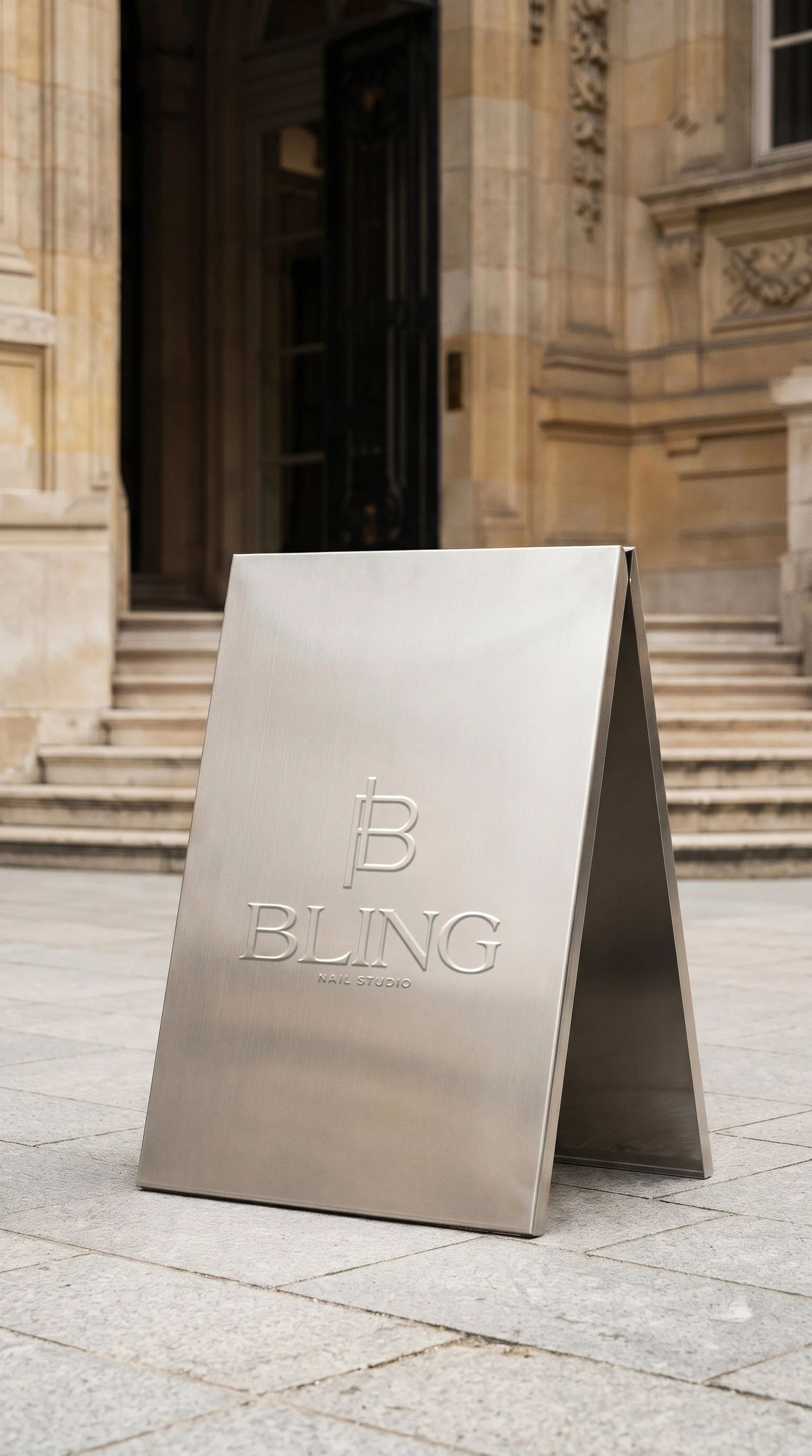
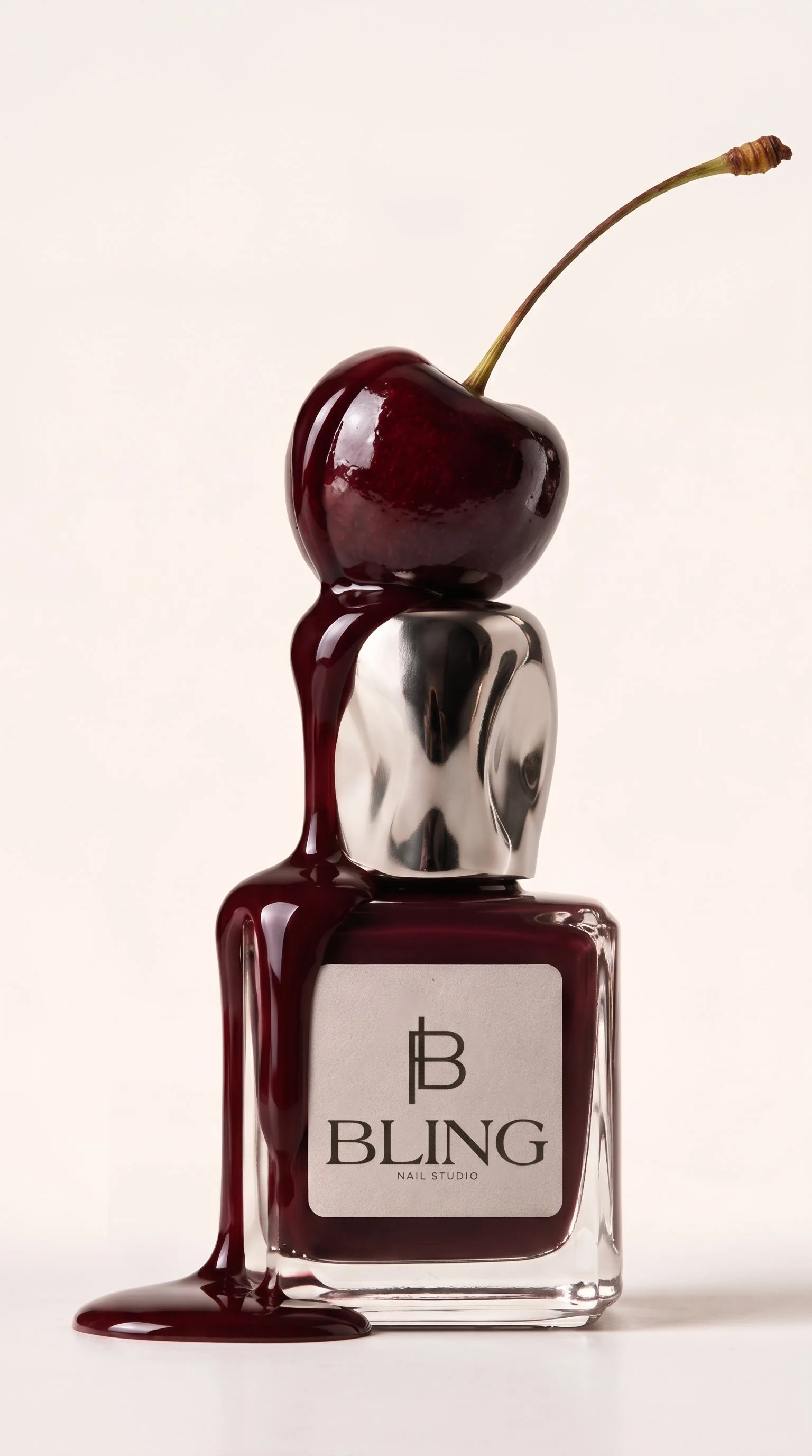
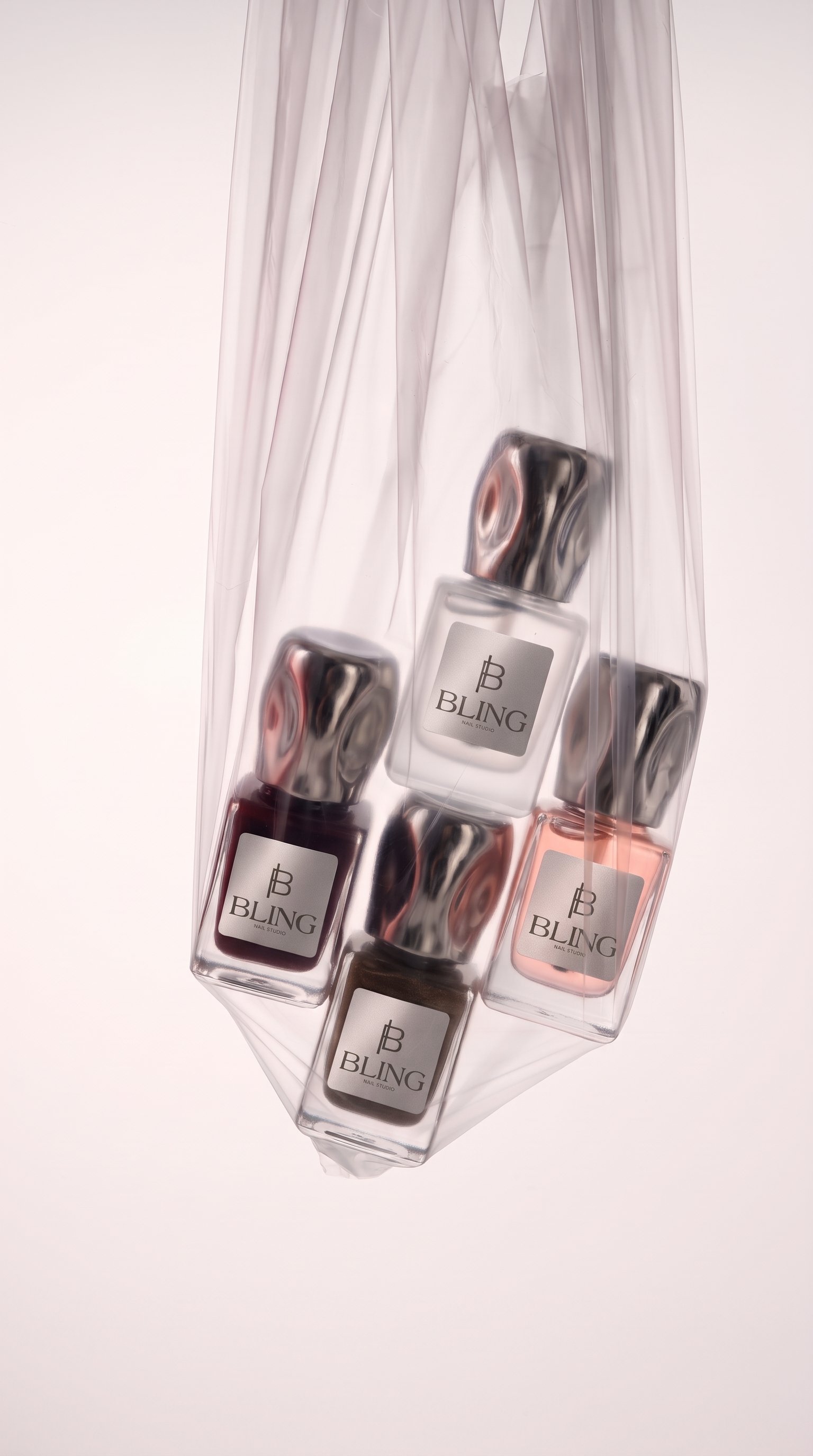
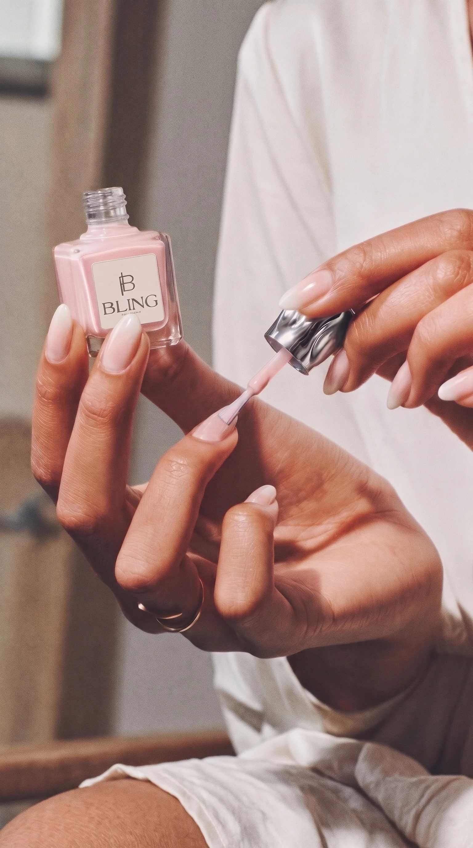
Brand mockups across packaging, signage, stationery, and environmental applications
Instagram brand rollout assets and supporting digital identity
-
Brand Strategy & Positioning
Development of a refined brand direction that preserved Bling's existing recognition while establishing a stronger position within Vancouver's beauty industry.
The strategy focused on communicating the qualities that define the Bling experience: exceptional service, consistency, trust, and genuine hospitality.
Brand Identity Design
Creation of a refreshed visual identity inspired by modern luxury and editorial design.
The identity features a distinctive custom B monogram, an elegant serif wordmark, complementary typography, and a sophisticated neutral palette. Together, these elements establish a recognizable visual system that feels polished, confident, and timeless.
Brand Collateral & Applications
Development of supporting brand assets, including business card and gift card designs, brand guidelines, and visual mockups.
The identity was explored across storefront signage, packaging, stationery, and other client-facing applications to demonstrate how the brand could maintain a cohesive presence across multiple touchpoints.
Digital Brand Rollout
Creation of supporting Instagram branding assets and launch mockups designed to introduce Bling's refreshed identity consistently across its digital presence.
-
The rebrand marks a new chapter for Bling Nail Studio, introducing a refined visual identity that honours the business's established roots while reflecting the elevated experience it is growing into.
Through a distinctive monogram, sophisticated typography, and a timeless neutral palette, the refreshed identity gives Bling a more recognizable and cohesive visual presence.
Designed to translate seamlessly across digital, print, packaging, and physical environments, the brand system provides a strong foundation for future growth while maintaining the familiarity and approachability that have long defined the studio.
The result is an evolution of Bling: polished, trusted, and distinctly its own.